Posts
I have been enjoying working in the G+ space - at +Peter Quinton. This space allows me to throw up plain photos and snippets of ideas and gives me direct (comment based) and indirect (+1 and view stats) feedback quickly (generally within 48 hours).A while back, G+ community mood started to firm in relation to slightly different types of posts.
1 - photos with relevant content: if posting original content, the inclusion of relevant textual context attracts greater attention and is positively received. Whenever possible, the photo should not contain text - if it does, the text should contain a reference to it so that it can be translated.
2 - reposting remotely hosted content: if posting links to your hosted works elsewhere, the community was divided. Some argue that this gave the casual viewer insufficient information to register meaningful feedback. Others argue this is a convenient way to direct others to remote information. I have mixed feelings. For the time being, I am completing a referral post in the same way as (1) but, at the end of the textual context, I will add a link to additional information.
3 - posting unrelated photos and text. In my own work, this was usually posting a critique or analytic post with an image, for color. This has the potential to leave a reader confused and, particularly if the post adopts a political stance, potentially invites the reader to fall into the trap of appearing to endorse a position with insufficient warning. With these posts I have now adopted the practice of simply posting my profile picture - or crafting a relevant image.
Animation
Increasingly, I am starting to experiment with animation to convey ideas or attract the eye. An apparently three dimensional object - or one that shows slight movement within, can cause a casual reader to look again. Sometimes that second look is one of alarm - animations can be huge - slowing down the general feed and racking up costs for those on limited download plans.
So, when I deal with animations, I have tried to minimize the size of the animation - restricting it to about the size on an ordinary uploaded photo (640*400, 72p/inch - <150k) - or, where possible, even less. This lets the animation load fast, cycle without issue and, hopefully, reduce any angst.
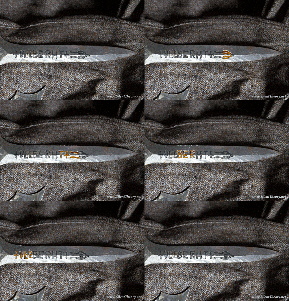
A recent example was an image I created to accompany a snippet of research about named swords.
 |
| Original image (106k) |
 |
| Image trimmed and centered, blade features smoothed, and design added (96k, full color) |
 |
| Design emphasized by animation designed to start 1 sec after load - and ending with a 5 sec delay (96k - 256 colors,no lossy) |
The sword I was seeking to illustrate no longer exists and was not described in any detail. I chose to depart from convention and use the blade to hand to emphasize the difference of this sword (it was enchanted and difficult to wield) from others. However I used a conventional etching for the period (which was, I am assured, regularly counterfeited) together with a design of a snake taken from a contemporary stone carving. Nevertheless, in the post I made it clear that the picture was a construct and directed the reader to a site with a good array of conventional items.
Peter Quinton
Palerang
July 2014
No comments:
Post a Comment